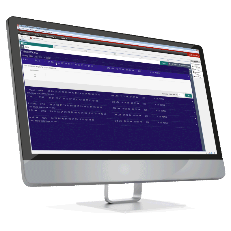
Sabre Red 360
Sabre's Red 360 platform is the largest GDS platform in North America. With over 100,000 worldwide active users, it's a dynamic booking solution that offers very highlevels of user customization.
Problem
Flight Centre, which is the biggest retail travel agency in the world, encountered significant difficulties in searching for a new Global Distribution System (GDS) provider. Their current GDS Point of Sale (POS) system was outdated, resulting in high staff turnover and training expenses while also losing sales to more user-friendly channels.
Solution
Sabre's response demonstrated the impact of storytelling, user experience (UX), and human-centered design (HCD). The objective of the UX team was to create a booking/POS platform of unprecedented scale while ensuring that existing users could easily incorporate a new GUI into their daily workflow.
Design & Stakeholder Relationships
Due to the vastness and significance of this project, I had several types of stakeholders involved. For the Branded Fares section of the platform that I was responsible for, I had to consider the input of product managers, product owners (over platform and systems), internal business units, and external airline carrier businesses to maintain a balance.
Major Achievements
Won a $1.1B contract from the world's largest travel agency by enhancing our product's UX to be more competitive in the market.
Collaborated with top airline carriers and travel agencies worldwide to design a multimedia interface that met everyone's needs.
Created a workflow integrating the new industry-standard airline content format into our products.


By The Numbers
$1.1B
Contract from the world's largest travel agency
1
API Partnership (Routehappy)
246,000
Users to convert to a GUI interface
8
Designers
40+
Stakeholders Involved
Where To Find Users
Flight Centre was initially skeptical about our understanding of their business problems and how our GDS Point of Sale could help with training and retention.
We had a year to launch a beta with their Canadian operations as our pilot customer. If the pilot were successful, we would gain their US and Australian operations as customers.

User Interviews. Changing Behavior.
Early user interviews showed me how hard it would be to change the behavior of users with over 20 years of reinfused workflow patterns. The strategy here was to keep the core process flow while enhancing the intuitiveness at prime opportunities.
One user quote that stands out for me was from a Travel Agent with a can of Tab soda on their desk, stating that…”I will DIE before I switch my software!”
I Co-Facilitated A Joint Leadership Design Thinking Workshop
After 12 weeks, the leadership of Flight Centre's US, Canadian, and Australian operations gathered at Sabre's headquarters for our presentation. The presentation was a rousing success, and they agreed to convert their Canadian and US operations to our new system for the pilot. To their surprise, we had also developed a working prototype of the primary interface. As a result, we could use it to demonstrate our usability improvements and even let their senior leadership use it.

Book Flights With No Margin Or Commission
After sorting out the Post-It Notes™, we focused on designing features that would cater to their business requirements. During this process, we discovered that all their businesses were struggling to compete with Online Travel Agencies (OTAs).
As a result, to save their customers' money, agents sometimes booked flights with no margins or commissions. On the other hand, Flight Centre would purchase flights at a discount and resell them for a profit, but they often remained unsold due to the unavailability of information about private inventory in their point-of-sale systems.

To address this issue, we developed color-coded visual cues that indicate which fares are advantageous to the agent, the agency, and the traveler. These cues serve as the gateway to a tool that enables agents to swiftly adjust the margin of any item. This allows agents to reduce the margin to beat a price offered by an OTA or to increase the price to generate margin on a flight where they would typically not receive a commission.

Good UX Sealed The Deal
Despite an initial setback, Sabre's HCD solution secured a $1.4 billion ten-year deal. Within a year, Flight Centre reported a remarkable 23.3% profit growth, totaling $32 million, and an 8.7% increase in total transaction value. This success was a result of our customer-centric design, a compelling UX narrative, and iterative design.
While securing the deal was a tremendous success, the best validation of the design came from Flight Centre's business results. Sabre's internal training team converted all their agents to the new POS six months ahead of schedule. In the six months following the rollout, Flight Centre reported an 8.7% increase in Total Transaction Value. In the first year, they reported a 23.3% profit growth, totaling $32MM.
Branded Fares
A new way to compare airline fare options in Sabre Red, with rich media content and highlighted fare attributes.
My Role
Lead Designer: I was appointed full design ownership over this feature
Scope
We needed a way to compare different types of airline fare options (branded fares) within Sabre's Global Distribution System (GDS) in a manner that highlights fare characteristics as well as rich media content.
Design Thinking Workshops, Data Collection, & Synthesizing
I organized workshops with our airline suppliers, including American Airlines, Delta, Air Canada, and United, to comprehend their perception of the products and services they offer. We employed the What's On Your Radar data collection method, followed by Affinity Clustering exercises to categorize the collected data. Finally, we used a hierarchical approach to provide context to the data.
Findings
We found the airlines wanted their product options to be prominently showcased throughout the workflow. We used this information to design more transparency of carrier fare options into our Branded Fare Workflow.


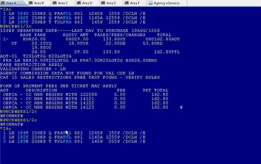
Legacy Command Line Data Audit.
First Steps
I created a visual map of the data and classified them into different flight scenarios. Additionally, I conducted a competitive analysis to understand the unique selling points of my flight system compared to similar ones like GDS's and OTA's.
Crucial Steps
I created a visual map of the data and identified the flight shopping scenarios that they correspond to.
I conducted a competitive analysis to understand the unique features of my flight system compared to other GDS's or OTA's.

New API Data Audit
I integrated a new API service call from RouteHappy for the branded fares display. My first step was to organize all the values to understand their hierarchy.

The Scenario That Broke The Design
Upon attempting to place the brand attributes in a column, it was discovered that over 35% of user scenarios included multiple brands for a single fare. This caused the design framework to break down, requiring further ideation.


Brainstorming With Stakeholders
Brainstorming With Stakeholders
A New Framework & Layout
I created wireframes for new layout options that focus on a new card format. This enabled the possibility of mixing fare types that were not associated with branded ones. Additionally, it facilitated the use of multiple brands and a more seamless integration of the airline's media content.
Compromise
This new design allowed me to discreetly hide the airline's rich media content, making it less burdensome while still being accessible with one click.


Whiteboard Brainstorming
Here, I started to use a card-based approach because it provides more flexibility in the UI container and aligns with the mental model established in other comparison matrices found on the web.


Surfacing The Critical Data via Widgets
After conducting card sorting and gorilla user testing, I concluded that the user required more information about a brand that could seamlessly integrate into our widgets. To address this, I decided to display the brand's name associated with a particular fare and the number of additional brand options available in the matrix.
New Design With Compermizes
I designed a new layout that was focused on a new card format. This has enabled the combination of fare types not previously branded with ones that were. It has also allowed for the integration of multiple brands and the airline's rich media content more seamlessly.
This new design has made it possible to discreetly hide the airline's rich media content while still making it easily accessible with just one click. This supports the user's cognitive load and enhances their overall experience.


Changing The Industry Forever
All the design and data challenges I went through were noted by all the stakeholders involved. As the industry data standards changed from a mainframe to a cloud-based service called NDC, I was tasked with reimagining this UI with fewer constraints and more ambition in a product called GetThere.
How It All Came Together
In this video, you can see how the vision for Branded Fares and my work around building a global API standard fundamentally changed this product. The work I started on the product has evolved into the industry standard for how travel companies can use dynamic booking data in their products.
Results
Based on the results of Card Sorting and User Testing, I concluded that the user required more information about a brand than could naturally fit into our Widgets. Therefore, I decided to show only the name of the current brand that particular fare belonged to, along with the number of additional brand options that were available in the matrix.
Wins
All stakeholders involved in the project have taken note of the design and data challenges that I had to overcome. As the industry data standards shifted from mainframe to a cloud-based service called NDC, I was entrusted with the responsibility of reimagining the UI of the product called GetThere with fewer constraints and more ambition.

1.1 Billon Dollar Design ROI
Due to the innovative designs that my team and I created, Sabre was able to secure a billion-dollar contract from its largest client at that time. The client cited the "increased productivity" of the application as the primary reason for choosing Sabre over its competitors and awarding them the contract.