

SafePoint
SafePoint is a travel risk management solution integrated into a broader travel program to help more accurately find and communicate with travelers impacted by an event. It automatically monitors travelers' trips, proactively notifies travelers that may be affected, and requests that they check-in in with their status so that you can quickly determine if they are ok or need assistance.
My Role
Lead Designer: I was appointed full design ownership over this product.
Problem
The platform was launching a new feature called Trip Disruption. The feature needed to be organically integrated into the current product feature set. This new feature was also central to the ROI of the overall product.
Scope
This new feature needed to present the users with flight disruption information on any traveler they supported(which could be in the hundreds) within the Dashboard and on a dedicated page.
Solution
I started by building the Dashboard data in the same format as the original cards. The data for this feature had a different type of relationship with each other. So, I had to keep the same visual structure while building new IA relations between the values.
I went with a table structure on the dedicated page emphasizing minimal, crucial data points to avoid the typical UI table pitfall of visual cognitive overload.

Design & Stakeholder Relationship
A global Product team was my primary stakeholder on the feature. Being a new Product team, their understanding of maximizing the return on UX involvement was while on the product.
UX Process Documentation
As the design owner of the project, I wanted to create a structure for UX project documentation and collaboration. To establish good habits, I visualized the steps and designed a graphic for my team. This helped us use our product team efficiently and build a process record for future designers to hit the ground running.


UX & Product Engagement Timeline
To start everyone off on the same page, I designed and brought this graphic into our kick-off meeting with the Product team to help them understand how UX deliverables and activities can illuminate the product value props in contrast to the desired user experience.

Crucial Steps
Conducted very early customer interviews around designs before user testing. This helped to answer basic data questions from the user's perspective instead of using assumptions around non-useability questions.
User Research & Pivot
The first few drafts had a lot of simple data and inline editing for notes and comments. After a few rounds of user interviews, I started to see a pattern for a need to show more flight information for context.
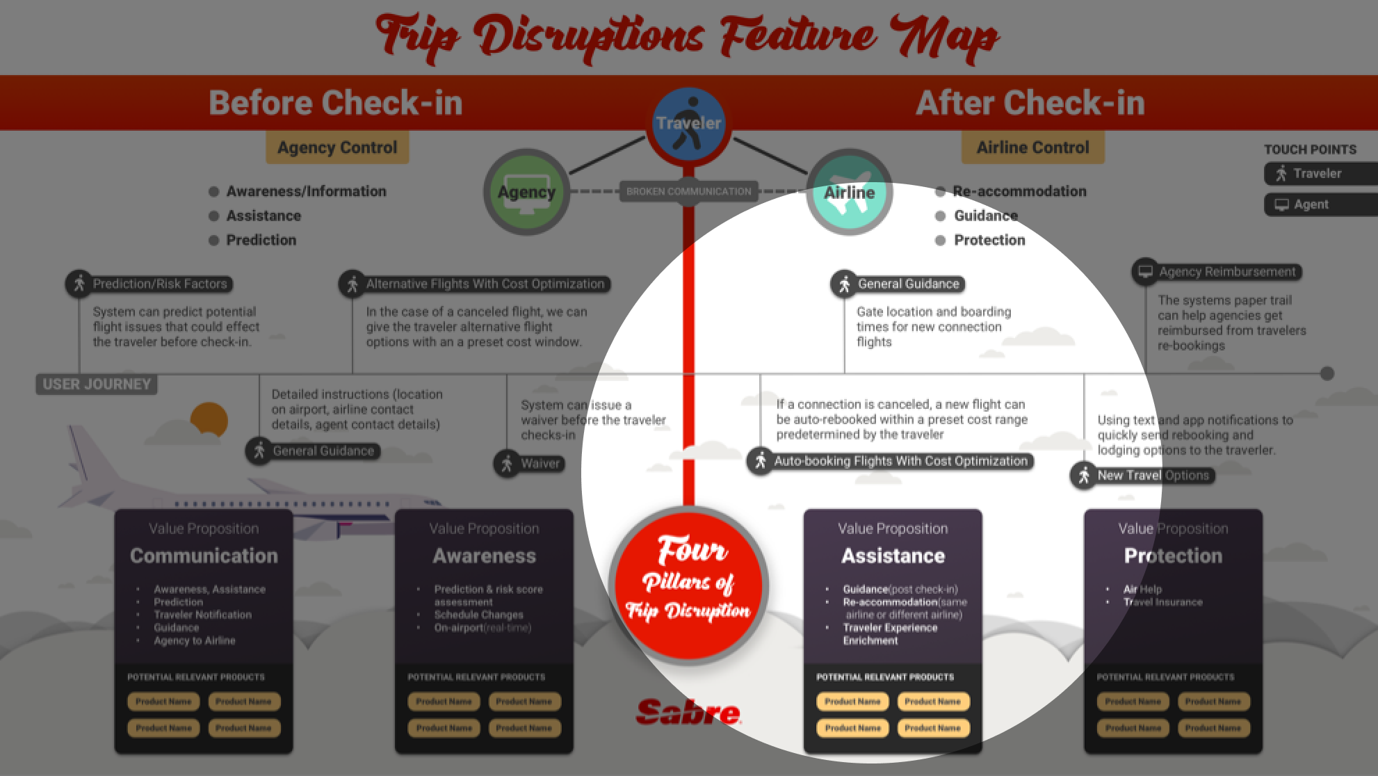
User Journey and System Feature Map
One of the problems more complex systems have is understanding how they can potentially interact with the user in different workflow scenarios. At this point, many questions were being asked about the system's capabilities, so I designed this graphic to give the Product team and other business units within the organization a "birds-eye view" of the system’s current and future capabilities.

Only The Essentials
Because more data was added to the table and there was a lack of need for the user to see notes and comments on this screen, the discussion was made to create a new screen/view centered around past flights that aren’t as relevant to the user.

They What Notes
My previous design was built for quick internal messaging and notes on a traveler’s itinerary that has been addressed. Early User Interviews showed that a messaging/note-taking functionality didn’t need to be so accessible. That real estate table would be better used for more context around the disruptions.
Past, Present, & Future Table Sections
We were getting user feedback about needing more transparency around what has happened, what is happening, and what to look for. Due to this, I broke up the table into a time hierarchy, giving it past, present, and future table sections.
Early User Interviews
I showed a few users our early designs. Most of the feedback came down to one thing: the disruptions were the main thing they cared about. Not just the type of disruption but also how many people are affected. The number of affected people in their organization equated to that agent’s workload for that day.

Key Take-Away
Just because you have it doesn’t mean you show it. I had to figure out what data applied only to the primary user goal and surround that with as much context as possible.

High-Value, Low Effort
Because more data was added to the table and there was a lack of need for the user to see notes and comments on this screen, the discussion was made to create a new screen/view centered around past flights that aren’t as relevant to the user.
Discovering New Design Opportunities
I designed a feature from this new value prop focus to give users quick flight connection options from within the disruption table. This would allow users to resolve most of their employee’s itinerary issues more effectively than anything they’ve ever experienced.

Understanding The Scenario
My first assumption of the dashboard data was the user would want to have a high-level overview of all their travelers that were currently being affected. This assumption didn’t count for the urgency of resolving a VIP traveler’s(typically an executive-level employee) itinerary issue before other employees. This drove me to change the hierarchy level of the “VIP” traveler data.


Testing & Pivoting
While testing a prototype of the application, I noticed users were not very enthusiastic about the last screen in the workflow, Traveler Details. I learned the problem was that the previous screen(Trip Disruption Table) had all the information needed to address any itinerary issues affecting a traveler.
Solution
Instead of trying to change the users' behavior, we decided to meet them where they were. I designed a Red App that could be integrated into the core Sabre Red 360 product and work with the main SafePoint application. This is where most traveler itinerary bookings and changes were already being made.


